Wednesday, April 13, 2011


I've had this idea for a few months, and wasn't sure if it would fit with this project, but I think it does in its commentary on global warming, which is rather superficial, but the more reminders of it we have the better, right? And if they have a sense of humor, than we can laugh a little and then go, oh, yeah, well, hmm....
The joke evolved a little bit since I first thought of it. Originally it was supposed to be two kids as if sitting in a class room and the one is sick, playing with a toy rocket (Earth). The other (Mars) wants to play with the rocket but, the teacher or somebody warns him, you don't want to get what Earth's got, do you? (humans, making us analogous to some sort of sickness or virus that's making Earth sick, giving him a fever (global warming)). But, this is what I decided to go with in the end. The explanation of the rocket is lessened without the toy rocket context, but...hopefully it still works well.
So I jumped in to drawing it pretty quick, scanned, and finished it in Photoshop. But, it seems to have worked out well. I think it has a pretty cohesive, relatively Threadless-esque style and good finish. So, I'll submit it and see how it does!

"Watching, Waiting..."


I've already submitted this design, but I haven't heard back yet whether or not it was accepted. This was a drawing of some sort of stylized deer antlers that I'd started a little while ago. As I finished it, they took on the feel of trees, so I thought of making it appear like a little forest scene within the bigger picture of the deer's head, and when I added the hunter, which started out behind one of the trees/antlers and ended up in a tree stand (after a suggestion that it might add to the concept), it became a sort of commentary on our relationship to nature. I didn't want it to be any sort of direct commentary on hunting, I was mostly just thinking of that eerie feeling I sometimes get when I'm walking in the woods that I'm being watched. Yes, you are. By nature. Yeah, I guess. But at the least, it made for a cool aesthetic, and I think this may be my most "threadlessy" submission yet, so, I've got some reasonable hopes for this one.

Monday, April 4, 2011

I think I need to utilize my illustrational skills more. I've been wanting to spend some good time on an elaborate line drawing, and I think that there's definitely a market for that sort of work on Threadless, provided it's not too detailed and has the right feel. Now I just need a good idea. The Facebook page for nature is worth submitting, I think, and it shouldn't take too long to make once I have all of the thinking worked out, so I'll probably get that one in as well.
Ok, I messed up that attempt, but it's alright, because some planning is definitely in order. But, I sort of want to set that idea aside. I think I need to figure out what the criteria are for a "successful" Threadless design.

1) People want to wear it (looks cool, says something cool)

That's basically it. I think I need to mostly consider more whether or it's something people would want to wear. And why. It doesn't just look cool, it satisfies some aesthetic interest. To the extent that T shirts are an expression of the person who wears them, what do people want to say about themselves/what aesthetic do they want to associate with? Ok, keep thinking...

Ah, criteria 2:

2) Looks cool, but takes it to another level, employs a clever twist.

Right.
Alright, I thought of an idea. A Facebook profile page for Nature. Well, I though of this last year as a potential for the social change poster's we made in TMP2. The idea being that Facebook would be no way to "befriend" nature, you gotta get off the computer and outdoors, right? I like to work with these kinds of parodies. But, as usual, I immediately started drawing it, deciding instantaneously on a hand-drawn, colored pencil look. Whoa. I didn't even let it sit for five minutes, didn't think maybe there might be a better way to do it. And if this is supposed to be the best it can be, really well considered and executed, than I should probably do that. It's as if I want the gratification to be as close to instant as possible, which I would imagine rarely happens for some artists. I like the process, being in the moment of making, but I really just want that product (or at least that's my conscious reasoning of it right now). That's why I like playing music, because the product occurs instantaneously with the making. It's the epitome of creative gratification, in my book. But dumb ol' visual art makes me wait. No, there's a lot more to it than that, and "art" and I have a lot of good times. I maybe just need to slow it down and see if I can't appreciate the finer things, the subtlety...I don't know, something. A deeper understanding and manifestation of my own creative visions. That sounds good. Ok. I'll probably get back to drawing that design though (once you start, you can't stop).

What to do now

Ok, time to regroup. The Earth Day challenge is over, so I have to decide how I want to continue with this project and what I want my end result to be. There aren't any nature related challenges at the moment. One might appear in the next few days or week, but I can't count on it. So, it seems I have to make designs for the general competition. Perhaps I should set a number, three sounds good, and aim to finish and submit them before the project is done. And I'm talkin' really well thought out, no compromise, air-tight, legitimate designs. Given the time to focus on making designs, I should be able to come up with my best submissions yet. But, my parallel goal is to manifest the Threadless style as much as possible, which will serve as an experiment to see if I am capable or if I even really want to (what's the value of it, will it help foster my own search for style or will it be counterproductive, or just noneventful, you always have to allow for that) and also help my chances at having successful designs. Three, hmm. Too many? What if I focused on just one? made it REALLY good. Well, I could focus on the first one, and have it take me as long as it takes to make it as perfect as I can, and if there's time to move on to a second one, then I will. The last question is, how to incorporate nature. It shouldn't be too hard to come up with good design ideas that express something about nature. But that feels too superficial for me. I like to have a definite, cohesive purpose. I don't want to just "make naturey t shirt designs" for my final CFC nature project. Before, with the causes challenge, the idea was contributing to activism. I could continue that now, and not be constrained by the specific purpose of the challenge. Alright, I'll get to thinking and see what happens. Flexibility is good.

Thursday, March 31, 2011

I've begun a new design, taking the idea of "A billion acts of green" to create another metaphor. The main idea that ought to be represented is that the acts of many, though small, are great when considered as a whole. Thinking of the hand, which is representative of human action, I almost automatically decided to make it a tree, which could then be multiplied into a forest, a vast forest. I envisioned a sea of green comprised of hands reaching upwards to look like such a forest stretching into the distance over mountains with a bright sky overhead. I think I more or less accomplished that, but the overall graphic affect might not have come together as I had hoped. Someone's first reaction was, "I think it's weird." To her, it looked like a poster for some creepy zombie movie. And, it does. Ugh, after a lot of work in Photoshop, it's a vast army of the dead rising. So now what? I tried to kill that affect somewhat:


...no it's still pretty much a massive crowd of zombies. Actually, I think that crop, losing the foreground (the green hills), made it even worse. Well, even if I don't think of a way to get rid of that image enough to bring the forest out 90% of the time, I'll still submit it. I had thought of giving the near "trees" brown trunks, but it didn't seem to work too well. Yeah, the hands are just...kinda creepy. I was going for a doodly sort of style but...oh well. Keep trying. This Threadless Challenge ends Monday I think, and I don't really have any time to make a whole other design so, I guess this is it for the Earth Day contest.


Monday, March 28, 2011

Well, I just couldn't leave it alone and tried to fix the type. Now it's definitely not confusing, but the space doesn't seem as natural. Still, I think this is the one to submit, finally.
Ok, here's the submission (this is slide 1 of 3). I can't think of anyway to resolve the wording problem short of redoing the type maybe, but it would lose its spontaneity and I don't think it's too bad. Looks alright on a shirt. As this one wasn't very matched to the typical or identifiable Threadless style, I think for the next one, not only will I really try to work out the concept well, but I'll make a sincere effort to channel the style. I'm not sure if I'm even capable, as I've sat down to work thinking that I would do just that, but it just comes out in my own style despite. Discipline I guess.

Sunday, March 27, 2011

Here's the first attempt. I started with just the apple and ants image, but then it became this bigger woodcut styled square. Not exactly typical Threadless style, but it could work. The main concern with it is that people read "Eart Day now" and then maybe "all together" when I wanted "Earth Day, all together now," but it's obvious why that happened. I'm think of making the two phrases different colors, though I prefer the all black, and it's sort of neat that it could be read both ways: "Eath Day Now, all together" or "Earth Day, all together now." Maybe that's not a good confusion, but if the color change just isn't working, it'll have to do. Or...I might be better off without the big woodcut addition and redoing the words.

Wednesday, March 23, 2011

Clean or sketchy? Precise line-work or "naive art" style doodle? Try both?


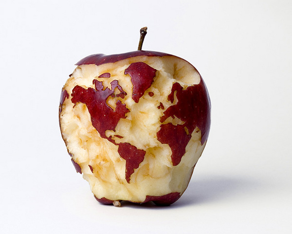
This is neat. I wonder if I could work with a real apple and use photography? It would be pretty bold, as I've only really rarely seen photographic designs on Threadless. Ok, so maybe not, but it's good to think outside that box...

Idea 1

Ok, I have an idea. I don't think its THE idea, but its a start. I plan to submit as many as I can and it shouldn't take too long to make, so I should use it as a warm up to get started. The concept is pretty sound I think and the look should be good. The challenge calls for an expression of "Acts of Green" with an emphasis on the collective effort of people worldwide, "A Billion Acts of Green." The idea is to have an apple, colored to look like the planet, being supported/carried by a large group of ants, and to have one or two standing off to the side as if having just taken a step back to see the bigger picture, to see what they all can accomplish together. The problem, I think, is that even though ants are well known for their collective effort, they also have a characterization as insignificant. Even though we know that they accomplish surprising things as a group, do people want to consider themselves as tiny insects, part of some sort of colony? Maybe not. But, it's worth a shot, should be fun, and it'll get me started.

Threadless T shirt design | Challenge 1: Earth Day | Deadline: April 1st

It's time to get organized. I have an objective and a shorter deadline than most at the moment, but I have something to aim for. The point is, however, to make the best effort I can, which doesn't mean just thinking until an idea pops into my, forcing it on paper, Photoshopping it, and submitting it. The challenge is to consider the design in the round, to consider how it's going to be received, let it be informed by its context (that is, the design precedents on Threadless), see what works and try to create a style that fits in exactly but retains my own style. The first thing to address, I think, is what medium do I want to use to begin with. It will of course end up in Photoshop and maybe Illustrator, but I want it to start on real paper first. My first inclination: pen and ink, with water color. I've seen water color on Threadless before, and successfully, so it might be the best way. The unmistakable mark of real media can be preferred, I think, and as I am not skilled enough with Photoshop or Illustrator to create the designs I want from scratch, I have to start, again, on paper.

Finally

Finally I feel that I have something to write about, something with the need for enough continuous thought, that I think I will find this useful. It is far from my usual practice to neglect an assignment, but I felt prohibited before and less so now. The semester did not start very well for me, and thought I had determined to not let it effect my work, in certain, and unexpected ways, it has. I don't like to issue disclaimers or excuses, but I thought I should give some acknowledgment, and of course accept the consequences of having begun so late. Hopefully, however, I can make it an all the more productive blog, something I certainly need practice at, but again, I do finally feel the need for it.